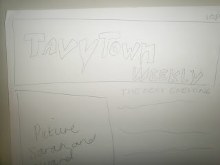
Before creating my practice magazine cover i designed a template that would give me a brief and simple idea of what i was targeting. Although the layout is not the same and my real cover came out with images the different side and information in a different way the template gave me confidence in what I was trying to create when doing this task. My goal was to create a newspaper styled cover that included images and an interesting story such as 'The Next Einstein'.
I am pleased with my over all outcome of my practice newspaper cover and doing this practice gives me for confidence when I go to final create my very own magazine that will be on Modern music and the charts.

Here you can see a close up image of the title was I was targeting for my newspaper, TavyTown Weekly. My title was a confident feature I keep the same on my template and real magazine cover. I chose to name my newspaper this as it connected to the location in which the magazine would be sold, the location being Tavistock College. It saying 'Weekly' suggest the magazine will be printed and sold weekly. I also find it a catchy and memorable title that I feel students would like. I find it important to have a visual aid with you almost when creating a magazine, it is just a little guide that will help you out with the basic gist of how you would like your magazine to turn out like. So as you can see my basic note page is very rough with no detail, this is only so that I can see where I would like to see images and writing and the type of layout and look I want to create. This is helpful and yet very simple.

No comments:
Post a Comment