Here are the images I have not used in my music magazine and why I have not used them and what I might of used them for in my magazine.

The cartoon image on the vinyl did not link to my magazine and so this is why I have left this image.

 These two images I both really like and if I was doing an article on the how to DJ section I would definitely used these images, but I didn't have enough room and found an image I thought worked more for my contents page.
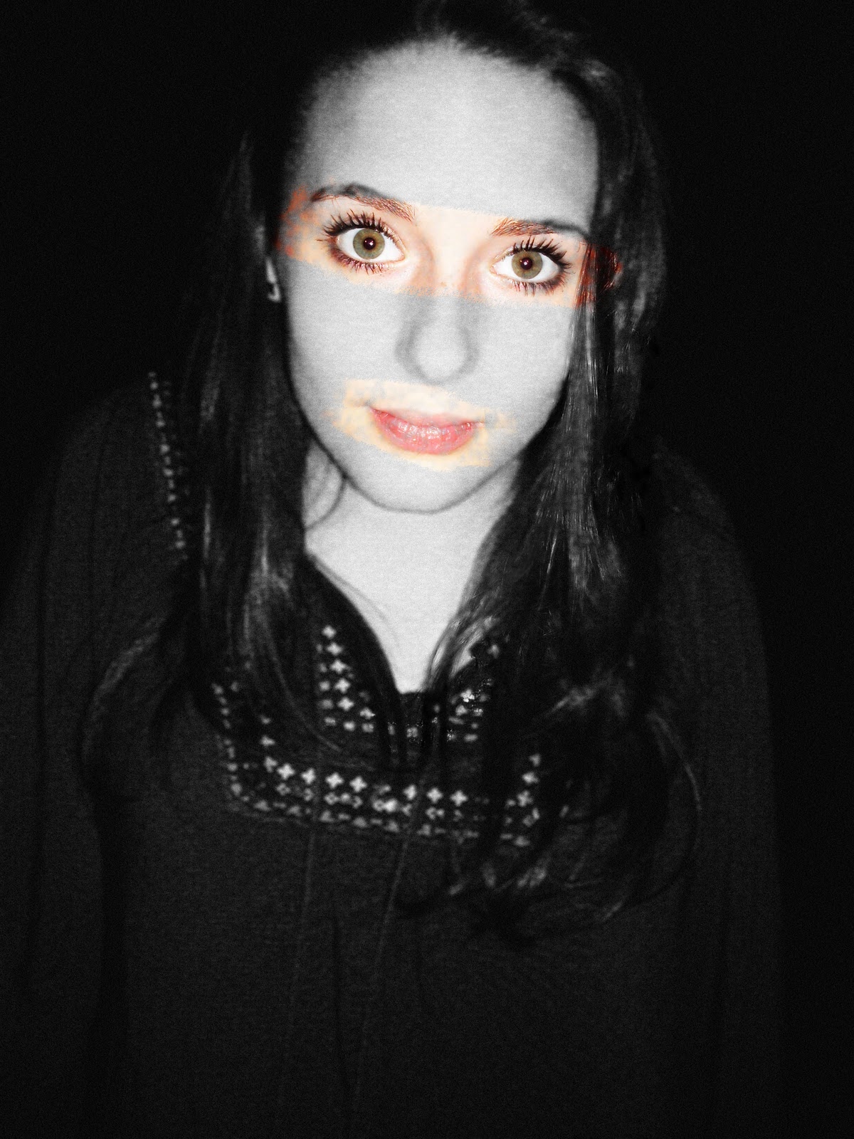
This image of my model Polly was a test shot, to give me a variety of ideas of who I might want to make out that her music type was. I have put her as an artist in a group called Passion In America, but with this image I could of made her out to be a DJ of some sort. So having this image just gave me variety.

I like this image and think the almost action shot style you get is really effective when thinking about the DJ section of my magazine. If I used this photo in my magazine I would of cropped into the hand action more and cut out the dodgy background that makes it look unprofessional as it is taken in a classroom.



 On the left is an image of my model Brad. I decided not to sure this image as I thought it did not look professional enough. With half of his head cut off I just did not think it made the cut. On the right is an image of my model Scott. I decided not to use this image as the main feature (the headphones) were not on show enough and it looked too casual for a model DJ image. I used another image of Scott on my contents page where the headphones were the main feature of the image to show the indication to music.

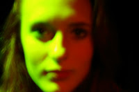 On the left and right is another image of my model Polly. Starting with the left image, I like the image as she looks as if she is actually signing and she looks very natural, but I thought it looked too like a 'school proformance' than singing in front of a crowd of millions. So I left the image as test footage and learn about how I wanted her to look and the type of vibe/effect the image gave off. The image on the right i preferred and thought it looked very different and the colours on the face were perfect with half green and half red but unfortunately the imaged was blurred and so was left for test footage. But after taking many more I came across the imaged I wanted to use in my magazine that I thought were perfect and felt I had personally developed in my idea of taking an image and how I wanted the image to look like.
 To the left are my two models Polly and Amy, both in the same kind of style and pose. From these photos I wanted to create the idea that they were singing in front of millions of people. Polly's image is again very natural and relaxed so I felt I didn't get the pop star effect so I left that as test footage that maybe later on I could play around with. The image of Amy I really liked, and I was stuck between this image and the image I actually used on my contents page. I played around with this image a bit and emphasised the lighting around her body, but in the end I chose the other image so I could play around with the background more and create the idea of a concert image for a review article on it for my contents page.
Here are all my other images that I have taken for testing on my magazine, I have either not felt they are professional enough to be put in my magazine or they were just not needed for other images have been used or that they were just tests of the image itself to help with my improvements when continuing to take the images.
When taking images for your magazine the one thing you need to focus on is just taking as many images as you can, take a large amount of images and taking a variety of shots means that when it comes to looking through your images you have more to work with and you can afford to delete images now and then if you feel they just aren't up to the standard. You can then edit and play around with the images you feel are useful to you and you wont need to go out again and gather everything together to get some more images all over again, it is just too much hassle.


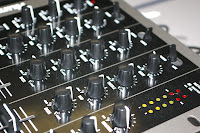
These three images of the DJ decks I really like. I like the close up shots so you can see the little details on the buttons you press. I took a few of these types of images as having the DJ decks out was a rare opportunity and I wanted to take advantage of it. I have included in my contents page a decks button image so felt I did not need to double image effect on my contents page.


 On the left and right is another image of my model Polly. Starting with the left image, I like the image as she looks as if she is actually signing and she looks very natural, but I thought it looked too like a 'school proformance' than singing in front of a crowd of millions. So I left the image as test footage and learn about how I wanted her to look and the type of vibe/effect the image gave off. The image on the right i preferred and thought it looked very different and the colours on the face were perfect with half green and half red but unfortunately the imaged was blurred and so was left for test footage. But after taking many more I came across the imaged I wanted to use in my magazine that I thought were perfect and felt I had personally developed in my idea of taking an image and how I wanted the image to look like.
 To the left are my two models Polly and Amy, both in the same kind of style and pose. From these photos I wanted to create the idea that they were singing in front of millions of people. Polly's image is again very natural and relaxed so I felt I didn't get the pop star effect so I left that as test footage that maybe later on I could play around with. The image of Amy I really liked, and I was stuck between this image and the image I actually used on my contents page. I played around with this image a bit and emphasised the lighting around her body, but in the end I chose the other image so I could play around with the background more and create the idea of a concert image for a review article on it for my contents page.
 Here are all my other images that I have taken for testing on my magazine, I have either not felt they are professional enough to be put in my magazine or they were just not needed for other images have been used or that they were just tests of the image itself to help with my improvements when continuing to take the images.
When taking images for your magazine the one thing you need to focus on is just taking as many images as you can, take a large amount of images and taking a variety of shots means that when it comes to looking through your images you have more to work with and you can afford to delete images now and then if you feel they just aren't up to the standard. You can then edit and play around with the images you feel are useful to you and you wont need to go out again and gather everything together to get some more images all over again, it is just too much hassle.