Lucy Gosling's Year 12 Media Studies Blog


In my blog you will see all the work I have done to
come to my final Music Magazine creation and all the research and planning that came with it. Enjoy (:


Wednesday, 30 November 2011

Test Footage

 Here are the images I have not used in my music magazine and why I have not used them and what I might of used them for in my magazine.

This image was taken for the section that was going to be about how to DJ in my magazine, although I like this image and it can be seen as slightly different, I wasn't sure on its worthiness on my contents page.
The cartoon image on the vinyl did not link to my magazine and so this is why I have left this image.

These two images I both really like and if I was doing an article on the how to DJ section I would definitely used these images, but I didn't have enough room and found an image I thought worked more for my contents page.


This image of my model Polly was a test shot, to give me a variety of ideas of who I might want to make out that her music type was. I have put her as an artist in a group called Passion In America, but with this image I could of made her out to be a DJ of some sort. So having this image just gave me variety.
I like this image and think the almost action shot style you get is really effective when thinking about the DJ section of my magazine. If I used this photo in my magazine I would of cropped into the hand action more and cut out the dodgy background that makes it look unprofessional as it is taken in a classroom.
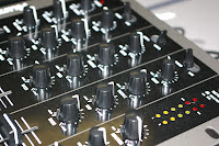
 These three images of the DJ decks I really like. I like the close up shots so you can see the little details on the buttons you press. I took a few of these types of images as having the DJ decks out was a rare opportunity and I wanted to take advantage of it. I have included in my contents page a decks button image so felt I did not need to double image effect on my contents page.

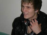
On the left is an image of my model Brad. I decided not to sure this image as I thought it did not look professional enough. With half of his head cut off I just did not think it made the cut. On the right is an image of my model Scott. I decided not to use this image as the main feature (the headphones) were not on show enough and it looked too casual for a model DJ image. I used another image of Scott on my contents page where the headphones were the main feature of the image to show the indication to music.

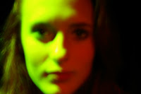
On the left and right is another image of my model Polly. Starting with the left image, I like the image as she looks as if she is actually signing and she looks very natural, but I thought it looked too like a 'school proformance' than singing in front of a crowd of millions. So I left the image as test footage and learn about how I wanted her to look and the type of vibe/effect the image gave off. The image on the right i preferred and thought it looked very different and the colours on the face were perfect with half green and half red but unfortunately the imaged was blurred and so was left for test footage. But after taking many more I came across the imaged I wanted to use in my magazine that I thought were perfect and felt I had personally developed in my idea of taking an image and how I wanted the image to look like.
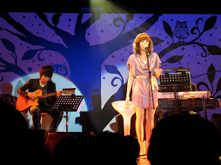
  To the left are my two models Polly and Amy, both in the same kind of style and pose. From these photos I wanted to create the idea that they were singing in front of millions of people. Polly's image is again very natural and relaxed so I felt I didn't get the pop star effect so I left that as test footage that maybe later on I could play around with. The image of Amy I really liked, and I was stuck between this image and the image I actually used on my contents page. I played around with this image a bit and emphasised the lighting around her body, but in the end I chose the other image so I could play around with the background more and create the idea of a concert image for a review article on it for my contents page.

Here are all my other images that I have taken for testing on my magazine, I have either not felt they are professional enough to be put in my magazine or they were just not needed for other images have been used or that they were just tests of the image itself to help with my improvements when continuing to take the images.
When taking images for your magazine the one thing you need to focus on is just taking as many images as you can, take a large amount of images and taking a variety of shots means that when it comes to looking through your images you have more to work with and you can afford to delete images now and then if you feel they just aren't up to the standard. You can then edit and play around with the images you feel are useful to you and you wont need to go out again and gather everything together to get some more images all over again, it is just too much hassle.  


Props that were used in my photographs.

Here are all the props I used for my images that are in my magazine.
This guitar was a prop used by Brad, who I have created a new artist who is currently doing really well in the charts called Cameron Carter. This guitar was owned by Brad.   

In this image Scott is wearing a pair of headphone that I borrows from my friend. These were used to create the effect of Scott being connected to music and being a DJ. 

Here are some DJ decks that I borrowed from my media teacher Mr. Bird. This was to link with the idea of being a DJ and creating a section in my magazine about 'how to become a DJ'.

Here you can see my model Polly Sargent has half here face red and the other half green. I used to lighting effects in the setting called The Playstation in my school to create this unique and interesting, strong image.
 The last prop i used was the microphone and the microphone stand. This was the school and was used in The Playstation again so I was able to borrow that and create the idea that my model Amy Sloman was a singer.

All these props were kindly lent to me by my fellow students and you can see that all props used in an image really create a vibe and make the difference.

I have noted down here all of the props that were used in my images that feature in my magazine. I have described them and photographed them, as well as saying what they were used for and who they were used by. A prop can add realism to a photo and making it more believable to the audience.
Each of my props are connected to music which I feel is very important for my magazine, although the lighting is not a musical prop it is a prop made for anything, but my other props show that my magazine is all about the music, there are no props to take away the image that there is musical inspiration taken from the photo to help influence the magazine of its modern genre. For example, the DJ decks and the Headphone are items in which are very modern and would be a interest in my readers, therefore, even with my props I am thinking about my target audience and my genre for my music magazine.

Models Profile


Name: Polly Sargent
 Age: 16
 Hobbies: Singing and Dancing.
 Personality: A happy and bubbly character who likes to have everyone laughing. She finds her own jokes funny. Enough said.

In my magazine, Polly plays the new band 'Passion In America' and she is the main singer. She is the main feature in my double page spread and that includes an interview of her new songs and how she got into singing. As well as 'the audiences questions' that have been taken from the online websites twitter and facebook to show our online connections to our public. This shows that my magazine is multi functional and interactive which make it up to date with the latest on the Internet, as twitter and facebook are very popular online. As well as this, Polly is my front cover, showing that this edition of the magazine 'NewSound' it is mainly featuring the new band 'Passion In America'.


Name: Amy Sloman
Age: 16
Hobbies: Meeting her friends and parties.
Personality: A very kind and sensitive character who cares for all her friends and who is always smiling.

In my magazine Amy is featured on my contents page in which she is Tabitha Rose, who is a popular already well known artist who is regularly in the top 40 charts. In my contents page it shows that inside is a article featured about her concert and a review on it. This is such a sneak peak in what is included in the magazine even though I have not actually included it in double page spread.

Name: Scott Doidge
Age: 19
Hobbies: Football and FIFA
Personality: One of the lads who likes to have a laugh.

Scott is featured in my contents page as well as a DJ, including an article about 'How to DJ' and is another sneak peak on what is included in the magazine. I think having a variety of like sneak peaks just shows the viewer how much the magazine has to offer. If there is alot to feature then it seems like you are getting alot of information for the money you are spending which can be seen as more popular than buying a magazine that may not have much included and so you don't really fancy spending the money.
Name: Bradley Crack
Age: 18
Hobbies: Football, guitar and likes coffee.
Personality: Outgoing and gets along with everyone he meets.

Brad is used as another artist who is currently one of the most successful singers and he has had a number of top singles and so I have created a sneak peak of interviewing Cameron Carter and just generally chatting to him about his latest songs and how he is getting on with his popularity and how is he currently in the battle for another number 1 single in the Top 40 UK charts.

Here is a little bit about my models who I have photographed for my own images on my front cover, contents page and double page spread. I feel it is important to show who you have included in your magazine and they can show the type of people you may wish for people to buy your magazine. For example, all of my model are between the ages of 16-19 this is within my target audience age range, as well as this their gender is mixed with male and female, showing the varsity that my magazine would like to try and hold.  
I have included an image of my model/ the image in which I used them in my magazine for and then their name, age as well as what they enjoy and are like, I think this is important as it shows the connection you have to your models and the connection you tried to give in your images to almost make your audience have the same connection. Under each profile I have included information of there where abouts in my magazine and how they have been featured

Monday, 28 November 2011

Draft Double Page Spread

 When starting my double page spread, I made sure that I had some research and visual help to guide me through the process of creating a believable double page spread for my music magazine.
Here is what i used to give me my own rough idea of what i wanted to create. Although this is not a chart/modern music example of a double page spread I was not using all the features that are on this double page spread as the genre of music looks to be more like alternative. So, cutting out all the alternative themes that have been made by the ripped paper style and the photos put on as if Polaroids and made it my own.
Here is my first draft in which I have interviewed the singer from Passion In America and talked to her about her past, present and future. To the right is more text which is actually questions asked by the general public from our online pages such as Facebook and Twitter, this creates an interactive connection to not online our actual magazine readers but also our online interactive audience who visit us online at Facebook and Twitter. This targets my young audience as Facebook and Twitter is a commonly used online chat site that anyone who is anyone has it, so to keep up with the styles and keep our magazine seeming fresh and up to date, I have decided to create this online connection to our magazine.  
I have also included commonly used features of a double page spread such as Boxes at the bottom indicating more information on the interviewee and advertisements on there latest albums and songs etc. This creates a realistic tone to the band. Also I have included a large quotation that is included in the interview and just made bigger to enhance what she has said and is a little snippet of something that is seen as a key factor, it is something of importance to highlight. 
Here is then my final draft. You can see I have kept all the same features but have changed my colour scheme. Keeping with the mixture of blue and pink which connects to my mixed gender audience of men and women I have made my double page spread visible to anyone. Although females would be seen as more interested in the article as the interviewee being a women, naturally women are more interested to know what she has to say about her life and how she has got to where she is today.
Doing this and creating drafts gives me the chance to almost have a practice before I start on my real double page spread. I think it is important to practice and research and learn about the features that will need to be included in a double page spread to make it look realistic and believable. As well as building up your confidence and creating in your head the image in which you would like to pursue your magazine to be like.  
From doing this I have learn what I need to include and the importance of what I need to include, for example the quotations, having quotations gives the double page that realistic look, all the music magazines of today that have a double page spread have these as a feature and so I need to include the feature in my own magazine. I have also learnt from doing a draft and then re-doing the draft to create a final draft I am happy with makes me feel confident about the type of effect I would like the reader to feel when reading my magazine. I have made the language quite casual as I want my readers to just have something easy to read, not something that takes great thought and care into reading it, again this connects to my young target audience as I used casual language like 'wow!' and 'random'. I have made a point at the type of language I want to use by not going too far with it. For example, in my magazine I used '(laughs)' to indicated the interviewee has just laughed, I could of used 'LOL' which is a young slag term, but by not going that far I am creating a boundary of where I would like my audience age to be, therefore creating the age I wanted to target 16-20 years old.

Drafting

Drafting is good practise when making your magazine, it allows you to develop and progress and change the magazine for the better. I have drafted a couple of times and within these you can really see my progression in making my magazine look more like a music magazine and something professional.


 This is a content page I found on the Internet which I felt was a good image to follow. With the variety of texts and colours and words scatted about as well as images. This gave me the right kind of idea on how I needed to make my magazine look. The features of a music magazine are quiet busy and crowded, almost to say you are getting alot packed into the magazine for your money, so the reader is gaining. As well as this, many magazine buyers and readers prefer the visual aspect of the magazine and not always are for the 'ramble' of text that is included. So making your contents page visually exciting engages and attracts readers.


To the left is my first draft where I have tried to include images I have taken myself and then edited on photo shop and try to create a 'scatter' effect, but I felt there was not enough images to give off this effect. As well as this, I have tried to include the some features that connect with the Internet, such as 'Follow us at' Twitter and facebook, as they are very popular at the moment and would advertise my magazine well. Also, the scan icon for those readers who have iphones etc can gain extra information on gigs and special competitions with just the scan of this little icon, but not taking away any information from those readers who don't have the technology as they have the choice to go on the online website which will include all the gigs and competitions as well.  In my first draft I have included the basic information of what is featured inside the magazine and set it out in a spacious and easy to read way. I found this wasn't working and this wasn't what a music magazine was all about. As you can see you the right is my final draft at the moment. You can see my progression in the way I have placed images and made things more tight and together, cutting down on text so it is more visual for the reader and I have made images bigger and seem like more of a feature on the content page itself. I am very pleased with my final draft at the moment and feel it is defiantly more visually seen as a music magazine that I feel my young adult target audience would enjoy.

Here is my inspiration for my front cover. I found the cover difficult and I needed to get in my head a sort of theme that my cover would follow. My target audience was young adults both male and female but maybe slightly more towards the female side which I have tried to show on my magazine cover. Firstly my main image is a women, and I think naturally the female sex are more interested in there own kind. Then I have included titles that are in a dark pink colour like on the magazine 'VIBE'. I found 'VIBE' a good example for me to follow as it a very popular R&B magazine that includes the type of front cover I would like to create. Having the blue and the pink suggest the idea of male and female and then the main image being a close up of a artists face, I have as well done this and so felt that this was a cover that would connect more to my own. But of course I have made mine in a different style as my magazine is not a R&B magazine it is a Chart/modern music magazine.

On the right is my draft front cover. At the time I was very unsure on my style I was trying to follow, which led to me not really having much colour and generally making my cover look very unprofessional. My first draft cover was very plain and 'boxy' and just didn't have the features of a music magazine cover that I wanted. To the left you can see my 'almost' final draft, this draft is 'almost' finished because I feel I could include more text around the image, but not much more so its close enough to a final draft with just a bit of 'tweeking'. As you can see in my final draft, I have more or less picked the colour scheme of blue, pink and grey. I feel these colours connect well with my audience being male and female as well as having the grey which is a very natural neutral colour that is no way led towards a particular sex. I have taken out the unnecessary boxed information that was on my first draft and just changed it for the band name to create a sure indication that the main image connects the the band 'Passion in America'. On the side of my final draft I have included very brief, short information on the artists that are featured inside the magazine, all but 'Rihanna and David Guetta' are made up artists I have done myself. But I have chosen to include 'Rihanna and David Guetta'  because they are very popular in the Top40 charts and are very popular and well know modern/chart artists.

Not only does drafting help to show other the work you have done and the images in which showed inspiration when creating the final product, but it also helps my own mind, it helps me to see what I need to do to change and improve, you can always improve a product to make it better and to make it more targeted to my target audience and my genre. From this I can see that for my final pieces of work I need to make sure that all three of my pages look as if they come from the same magazine, I will take this thought with me when creating my double page spread draft.

Friday, 25 November 2011

IMAGES TAKEN- Manipulation

When making your own music magazine you need to include lots of images that have a variety of camera shots as well as style of edits to give your magazine that visually exciting effect. Here are the images I have included on my contents page and the originals I had first, to then show the progression I have made in creating an image I felt was good enough to be placed on my contents page.


Here are some of my main images on my contents page and their originals and the edits I have done. The first two images I have tried to take an image that looks musically and casually like accidental taken. Then I have enhanced the colour and then deleted the background, so when I place it on my contents page it looks more professional.
The second two images I have placed an image that I found on the Internet and made it the background of the image to make her look like she is on stage at a concert, which I would then write on my contents that featured inside is a review of her concert.
My last two images are again for a made up artist that I will be featured in my magazine, again i have just enhanced the colouring of the image and then deleted the background giving it a finished and professional look.

Here I show the manipulation I have made on the main images that are included in my magazine, It shows the original image and then the edit I have made using Photoshop. You can see in some I have removed the back ground or replaced the background with another image to influence the image to be on stage at a concert. As well as this, I have enhanced colouring and made the image contrast together to look more 'done' and professional.
It is important to show your original image because you can then see the progress that have been taken to create a image I felt was good enough to become a main image in my magazine. As well as this, I can show my talent in taking a image and create a whole new image from just working on photoshop. This is an important feature to make a image your own and not look like an original camera image, I want my audience to look at my images and think I have paid lots of money to create an image that really was only taken on a camera and edited well.


Here you can see I have an image that I have not taken myself. I have then placed the image, deleting a fair amount of the original image to create the illusion my model image is singing on stage. I would fairly say that although this image is not my own, this is the only aspect of all the images taken that is not my own and I have edited heavily upon the image almost taken away any idea of what the original image even looked like. This image was found on Google and was available for me to use. I have not taken advantage of the free use of this image and just used the image itself, but I have heavily edited and made a clear attempt to rid of any main aspects of the image, such as the singer, to make the image my own originally manipulated image. Therefore no permission for the image was asked for, I have professionally working with the image to make a fair statement and also made a low profile on my magazine for the image to make it a fair situation.

TITLES

Titles are important on a magazine and a good variety of interesting titles is good to have in your magazine. I have tried to do this and have included these titles for my contents and front cover pages.
First I looked at titles for my contents title, I found this hard because you have to make sure it connected to your front cover as well as fitting well on the page but making it still look attractive.


My final choice for my contents title was this one, but I edited the background and colour to it to make it stand out on the page more. 
Then I looked at titles for my Featured title that would be on my contents page indicating the section where what was in the magazine would be seen.


I found choosing this title slightly easier as it was just a tiny feature on the contents page and could be an easy and simple text that everyone could find easy to read.
Then I had to find titles for the odd titles. I found a title for my made up band easily and found it a simple but slightly more girly title as the bands main singer was a girl it showed the femininity of the band. 
Then found the title that would indicate the section of information for where you could contact the magazine or follow the magazine online such as facebook and twitter.
Then I thought that to make my genre a little more obvious I would add an extra title to the end of my NEWSOUND name. Adding TOP40 UK indicates that the magazine is in connection with the UK TOP40 charts, which is a high indication to modern music, so that my audience know what kind of magazine they are about to buy.
This is my TOP40UK title that is situated at the end just under my NewSound title.

So as you can see I have tried to have a variety of different fonts, to make my magazine visually interesting.

Here I have tried to show the variety of titles I looked at before choosing the title I felt was right for my magazine and right for the image I am trying to create for my magazine and the genre. Texts are a key factor of a magazine it magazine is print and print is texts. Having interesting and a variety of different texts means that my readers are continuously interested. But I have included too many different texts as the recommended is around 3-4 different styles of texts, this means that you don't lose the image of your magazine by having too many different styles taking over the magazine and its style. A certain text style can be associated with a magazine, so keeping with the styles can help the audience remember the magazine.